So, let me get right to it...
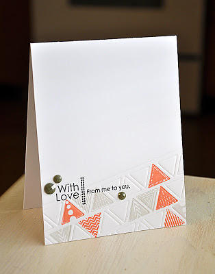
First up, a card using all three of the items I am showcasing today... Side By Side Sentiments, Tiny Triangles and Cover Plate: Triangles die.
I began by impressing the die at a slight angle. Here's How: Using the traditional embossing sandwich (for my Cuttle Bug embossing machine) I ran it through my machine while using a Post It Note to hold the die into place on the card front. Here's A Note: I did stamp the sentiment before impressing the die and the triangles after.
My next project utilizes the Side By Side Sentiments set and the Cover Plate: Triangles die. Here's A Fun Idea: The triangle strips were trimmed by hand from a die cut cover plate, from white cardstock. I totally spaced and forgot to take a pic of the process. Boo. Just A Note: But, once trimmed I stamped the ocean tides, new leaf and limeade ice ink pads directly onto the trimmed triangles.
The sentiment was selectively inked using the same colors.
For the final project I've used the Side By Side Sentiments and Tiny Triangles stamp sets. In a fun color combo of aqua mist, melon berry and soft stone.
Here's A Tip: After finishing all the stamping, I felt the bottom right corner was not quite strong enough to be the focus. So a few perfectly placed gems did the trick of catching the eye.Well, that's all I've got for you today. Just remember... these stamp sets and die will be available for purchase through Papertrey Ink, beginning May 15th. In the mean time, I'd love to know what you think so far, so please feel free to share!
Now, be sure to visit Nichole Heady for more peeks. Also, Heather Nichols, Dawn McVey & Melissa Bickford have peeks to share with you of their newest sets for the month.
Thanks so much for stopping by!
Maile
With Love Card...
Just A Little Note Card...
Get Well Card...


Triangles are the new popular banner shapes.
ReplyDeleteMelissa
"Sunshine HoneyBee"
WAw this triangles look just gorgeous and your cards are all so beautiful. hugs! Mojca
ReplyDeleteWonderful ideas, Maile - love your new sentiment set :)
ReplyDeleteHappy Mother's Day!
Loving the triangles and the new sentiments! Gorgeous cards!
ReplyDeleteSo I've been thinking that the design of your new sentiment set is fabulous, but a little too CAS for my design aesthetics. Then I see today's post and I am blown away. The way that you paired it with the triangles is striking. Your use of color, both the choice and the placement, is brilliant. I think that I need to go back through your blog again and study it, which would be better than any card making class. Enjoy your Mother's Day.
ReplyDeleteWOW MAILE!!!!!!!!! These Triangles look FABULOUS!!!!!!!! :) LOOOOOOOVING your contribution/s to PTI!!!!!!!!! :)
ReplyDeleteI enjoy your creative ideas. I like the triangle plate and the side sentiments. The plate allows simple cards look like you spent hours on the cards.
ReplyDeleteI cannot tell you how impressive your creativity is! Thank you so much for being part of the Papertrey team.
ReplyDeleteThanks for sharing these great cards. Really looking forward to being able to get your side by side sentiments!
ReplyDeleteWOW!!! These are incredible Maile!!
ReplyDeleteWonderful! I just love everything that you do!
ReplyDeleteLove the triangles and the side by side sentiments, Maile! Your cards gorgeous
ReplyDeleteNice stamp set and triangle cover plate die! Great cards! :)
ReplyDeletethat second card....wow. Amazing. So much texture and so modern-looking. Loving it.
ReplyDelete